AI 3D Illustration Prompts: The Finish Is a Number, Not an Adjective
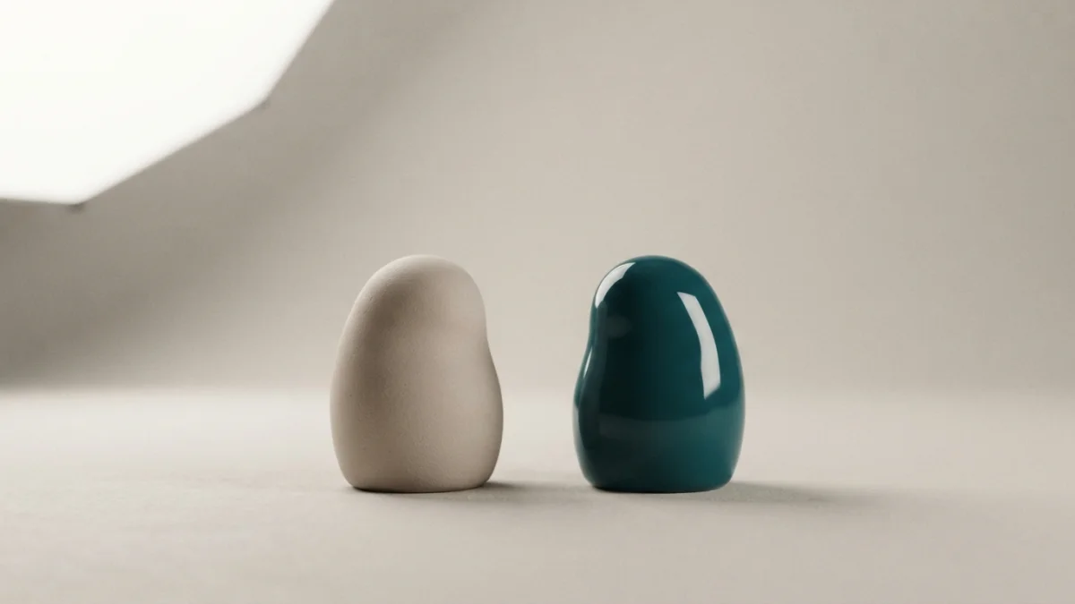
Image generated with AI.
Two prompts can both say 3D clay and one comes back looking like cheap plastic. The difference is not the adjective: it is the roughness of the surface and the size of the light reflecting in it, and the model decides neither.
Two AI 3D illustration prompts can both say "3D clay" and one comes back looking like cheap plastic. The difference is not the adjective: it is how roughly the surface scatters light and how big the light source is.
People keep rewriting the material word, and the render keeps answering with the same varnished look. A finish is not a category you name, it is a sharpness of reflection you either declare or leave to the model. Below: the two variables, how to read them on an image you already generated, three catalog prompts at different positions on the question, and a four line card to paste before generating.
AI 3D Illustration Prompts: A Finish Is Two Numbers, Not a Material Name
"Clay", "ceramic" and "plastic" all arrive as style associations, not surface specifications. Nothing in those words says whether the reflection is tight or spread out, and nothing says whether the light is a small hard source or a large soft one. Those two things are what your eye reads.
A renderer makes the distinction explicit. In Blender's surface documentation, the roughness of a glossy shader controls the sharpness of the reflection, from 0.0 for a perfectly sharp mirror to 1.0 for a very soft response (Blender manual, surfaces). Image models do not take that slider, but the relationship it describes is the one visible in the output, so use it as a way of thinking, not as syntax to paste.
Roughness Is How Sharp the Reflection Is
Low roughness keeps the reflection intact: the environment arrives as a recognizable, edged shape. High roughness scatters it until the reflection is a broad wash with no boundary. Unglazed clay sits far toward the soft end; glazed ceramic and vinyl sit near the sharp end. Same object, same pose, different answer to the light.
The Light Decides the Size of the Bright Spot
The second variable is not on the object. A small source produces a small intense highlight; as the source grows, the highlight spreads and loses intensity. Photographers rely on exactly this when they swap a bare bulb for a panel (Strobist, specular highlight control), and a 3D scene behaves the same way, because a surface can only reflect what is in front of it.
Together the two make the failure mechanical: a matte material under a small hard source, or a glossy material under a tiny point of light, both read as cheap plastic. The prompt said clay. The physics said lacquer.
The Ten-Second Highlight Test
Three checks on the image you already have.
The bright spot. Look at a curved area, a shoulder or an edge, at 100 percent. A hard edge with a few blown out pixels means a small source or a low roughness surface. A wide gradient with no border means a large source or a high roughness surface. A specular highlight is a strong cue for the shape of the object and for where the lights sit (Wikipedia, specular highlight), which makes it cheap to read.
The contact shadow. Where the object meets the ground. A short dark line settles it; a broad halo leaves it floating, and floating is what makes a piece feel pasted into the frame.
How many lights. If two highlights on the same object point in unrelated directions, the image has two environments. One source means every bright spot tells the same story.
Prompt 1 - The AI 3D Illustration Prompt That Never Names Its Surface
The charming 3D character illustrations style prompt is a good first case for what it does not say. The listing promises charm. It is filed under FLUX.2 Klein at $2.99 and declares no material and no light setup, which puts the decision where it belongs.
Use it for a single piece: a landing page illustration, an empty state, a hero figure. The style carries the character and the composition; your light clause carries the finish. This is where people break a working prompt, usually by adding ambition: "dramatic lighting", "rim light", "cinematic contrast". Each adds a second, smaller or harder source, and the charm you bought turns into the plastic look you were avoiding. Add a surface, add one source, stop.
Prompt 2 - The One That Names the Plastic
The turbo 3D render icon prompt is the opposite case: it names the material out loud. Glossy soft plastic, rounded forms, pastel palette, soft studio lighting, soft shadow, plain light background, centered subject. The listing says it is tuned for turbo image models.
Read the clauses as a pair and they agree. A glossy material under a large soft source gives an extended sheen, not a pinprick of white.
Why "Glossy Plastic" and "Soft Studio Lighting" Agree
Neither clause fights the other. What the prompt still does not say is how large that soft source is, and the finish drifts in that gap. Soft studio lighting is a mood phrase; a panel the size of a window is a measurement. The model can satisfy the mood with a smaller source than you pictured, and it will, because a small source makes a more dramatic image. A tight bright point on an otherwise soft object is that happening. Name the size, not the mood.
Prompt 3 - The Finish as a Field
The MJ logo icon style guide prompt treats the finish as a declared field. It asks for a style, a concept and a palette, and the catalog lists 3D clay among the style examples next to flat, gradient and line art. It also fixes a solid white background, a centered subject, simple forms, a subtle shadow, no text, and a 1:1 frame.
That makes it the cleanest test bench in the catalog. Run the same concept twice changing only the style field and nothing else in the frame moves. Clay against glossy becomes a comparison rather than two unrelated pictures. Once the field exists, a finish stops being a label on the title and becomes a variable you set.
The Finish Card: Four Lines Before You Generate
Write these four lines once and keep them. Paste them into every image prompt, in this order, before any style adjective.
- Material. What the object is made of: unglazed clay, glazed ceramic, soft matte plastic, glossy vinyl, brushed metal.
- Roughness. Matte, meaning the bright spot has no visible edge, or gloss, meaning the bright spot has a crisp edge. Pick one.
- Light. One large diffuse source, panel sized, no second light, no hard spots.
- Contact. A soft shadow sitting directly under the object, no glow, no floating.
Then check the card against itself. If line two says gloss and line three describes a small hard source, the render reads as cheap plastic however well line one was written. If you cannot fill line three, you are not choosing a finish; the model is choosing, and it will pick the version with the most contrast.
Why Gloss Dies at Icon Size
A hard highlight occupies very few pixels, all at maximum brightness. Shrink the piece to 32 or 64 pixels and that cluster can cover a large share of it: what survives is a white smudge, not a silhouette. A matte finish spreads the light across a gradient, has no point to blow out, and keeps the outline readable. The contact shadow anchors the object without a highlight that no longer fits.
Gloss is not a mistake; at large size it reads premium. What you cannot do is ask for gloss, deliver at icon scale and expect the form to survive. The final size is a decision made before the prompt, because light is baked into the pixels: you can flatten contrast afterwards, you cannot move a source that was never in the scene.
FAQ
How do I stop AI 3D images from looking like plastic?
Name the roughness and one large diffuse source, and exclude small hard highlights. "Matte" on its own is an intention, not an instruction.
Does writing "clay" in the prompt do anything?
It sets a style association. If the lighting clause in the same prompt asks for something hard or dramatic, the result reads as clay that has been varnished.
Why do my 3D icons turn into white blobs at small sizes?
Because at a few dozen pixels the specular highlight covers most of the piece. A matte finish keeps the silhouette instead.
Can I fix the finish after generating?
Not really. The light is already in the pixels. You can flatten contrast, but you cannot relocate the source. Regenerate with the corrected card.
Start With the Card, Then the Style
Pick a style prompt for the subject you need, then paste the four line card on top. If the subject should already carry charm, start with the charming 3D character illustrations style prompt and add only a surface and a light.
LikePrompts Editorial
Practical guides for getting the most out of AI prompts — written by the LikePrompts team.