AI Image Prompts for Contrast: The Model Picks Both Ends
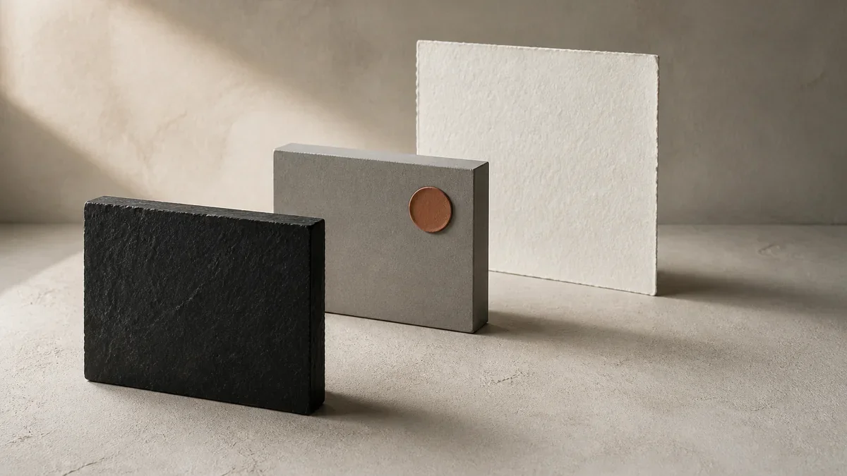
Image generated with AI.
Ask for contrast and you get an adjective. An image has two ends, the darkest value and the brightest, and if your AI image prompt does not name them, the model fills both with mid grey.
AI image prompts for contrast usually fail on an adjective. An image has two ends, the darkest value and the lightest, and if the prompt does not name them, the model puts mid grey at both.
The frame looks fine in a thumbnail and reads flat anyway. Nothing is truly black, nothing keeps detail in the white, and the subject floats in a middle band with no separation by value. That is the look people call "AI" without being able to say why. The repair is not a stronger word; it is two positions.
AI Image Prompts for Contrast: A Distance Between Two Values
Photographers settled this decades ago with the Zone System, the technique Ansel Adams and Fred Archer built to choose exposure by placing each important element at a decided position on a scale from black to white. The vocabulary is technical, the idea is not: you pick where things sit. What matters for AI image prompts for contrast is that move, tone as positions rather than a feeling.
The Two Ends
The black point is the darkest object in the frame, and it has to stay a value, not a hole of noise. The white point is the lightest object, and it has to keep structure. A small reflection can burn out without costing anything; a shirt, a plate or a column of steam cannot.
Everything between the two ends is the tone budget, and the detail lives inside it. Move one end and the entire distribution shifts.
The Middle Is Where the Model Lives
The default of a generative model is the safe middle: the average professional-looking frame from its training, with a burnt white on top. That is why ultra detailed, 8k and professional never repair a flat image. They add texture in the middle and leave both ends alone.
Three AI Image Prompts for Contrast, Three Tonal Situations
Three prompts in the catalog sit at three tonal positions and fail in three ways. None is broken. Each leaves the ends of the scale undecided, and the model decides for you.
Backlight: The Widest Range and the Weakest Face
Cinematic portrait, golden hour fixes the hour, a backlit subject, a warm amber rim light, an 85mm lens at f/1.8, film grain, a Portra 400 palette and natural skin texture, closing on --ar 4:5 --v 6 --style raw. It sells for $2.00. What it leaves open is the fill on the face and both ends of the scale.
Backlight carries the widest range of the three. A scene can hold more range than the output will, and when it does, one end is lost rather than improved; that is the plain meaning of dynamic range. So the sky becomes the white point and burns first, while the face lands on the dark side and the model either lifts it to mid grey, an invisible rescue, or lets it sink. Say that the face is the lightest value that must keep structure, and how much of the sky edge may burn: a rim, not a band.
Grey on Grey: The Flattest Frame and the Word "Gentle"
FLUX Photorealistic Portrait fixes an 85mm lens at f/1.8, real skin texture with pores and fine hair, reflections in the eyes, a soft key light from camera left, a subtle warm fill, a neutral grey studio background with a soft falloff, Portra-like grading, sharp hair detail, focus on the eyes, no heavy makeup, no filters and no plastic skin. It sells for $2.99.
It is the only prompt of the three that writes contrast at all, and it writes it as an adjective: "gentle contrast". With a grey background and diffused light there is nothing near black in the frame, so lips, hair and the shadow under the jaw drift to grey and the face reads waxy. The repair is physical rather than verbal: put something genuinely black in the frame, hair or a garment, and keep the background one step below the face.
High-Key With One Dark Anchor
MJ Food Styling Photography fixes a 45 degree angle, soft window light from the left, visible steam, garnish, rich warm tones, visible texture on every ingredient and magazine quality, with no hands and no text, closing on --ar 4:5 --v 6.1. It sells for $2.99.
It already carries two physical ends without naming them: a dark slate plate as the black, the steam as the white. This is the territory of high-key lighting, which lowers the lighting ratio and softens shadow, and of its opposite low-key, which concentrates the frame in deep shadow. High-key is exactly where steam fails: it burns first and becomes a white patch without wisps, while the slate under soft light settles at charcoal. Name both ends and the dish keeps its separation: the slate reads near black at the edges, the steam keeps its wisps.
The Tone Card: Four Lines Before You Generate
Four decisions, written before the prompt itself. They take less time than one regeneration and work the same for a portrait, a plate or a product.
- White point. Which object is the lightest, and what it must keep. Eyes, steam and label text always keep.
- Black point. Which object is the darkest, and how dark it may go. "Deep black with the surface still visible" is a usable instruction; "dark" is not.
- Where the subject sits. One step above or below the background, never the same value. This single line fixes most of the flatness people blame on the model.
- What may be lost. A tiny reflection or the edge of a sky is expendable. A shirt collar, a plate rim or the wisps of steam are not.
The order matters: white, black, subject, what may burn. The white end is the one you lose first, so it is the one you decide first.
Three Tests on Any Output
None of these needs an editor. Each takes under a minute and answers a different question.
The Black Test
Crop the darkest patch and look at it at full size. If it is even grey with noise, the image has no black point and will read milky on a small screen. The repair belongs in the prompt, not in a slider: a real dark object in the frame, or a line that says how far the shadows go.
The White Test
Find the lightest patch. A small, hard reflection may be burnt with no consequence. A shirt, a plate or steam with a hard edge and an empty interior is a hole, and it shows more in print than on screen. If the white has no interior structure, say in the prompt what has to survive inside it.
The Grey Test
Convert the image to greyscale and look at it at feed thumbnail size. If the subject falls apart against the background, the frame separates on colour alone, and colour is the first thing lost on a small screen or a cheap print.
What the Model Cannot Know
Three things stay outside the prompt, and they matter most. Which end of the scale your use needs: a thumbnail wants separation by value, a poster wants both ends with detail inside them. Which physical black object exists in your scene, because the model will invent a plausible one that does not match your product. And that "professional" is not a tone, however often it sits next to one.
The last pass is human. Before approving, look at the darkest patch and the lightest patch, in that order, and ask whether each is still a value you can see into. Everything else in the frame is negotiable; those two are not.
FAQ
Why does asking for "high contrast" return crushed blacks?
Because the phrase names an intensity, not two positions. The model spends the whole budget at one end, usually the bottom, and detail in the shadows disappears. Naming the darkest and the lightest object gets a usable range; an adjective gets a caricature of one.
Does "HDR" or "cinematic" fix a flat image?
No. Both add texture and local variation in the middle of the scale, which is the part that was never missing. If the ends are undecided, a stronger adjective only makes the middle busier.
Can this be controlled without talking about camera settings?
Yes. The tone card speaks about objects and values, not exposure. Naming a black slate, a white sheet or a face that must keep structure is enough, and it survives any model that reads plain language.
LikePrompts Editorial
Practical guides for getting the most out of AI prompts — written by the LikePrompts team.