AI Prompts for Background Images: How to Get Copy Space Instead of Clutter
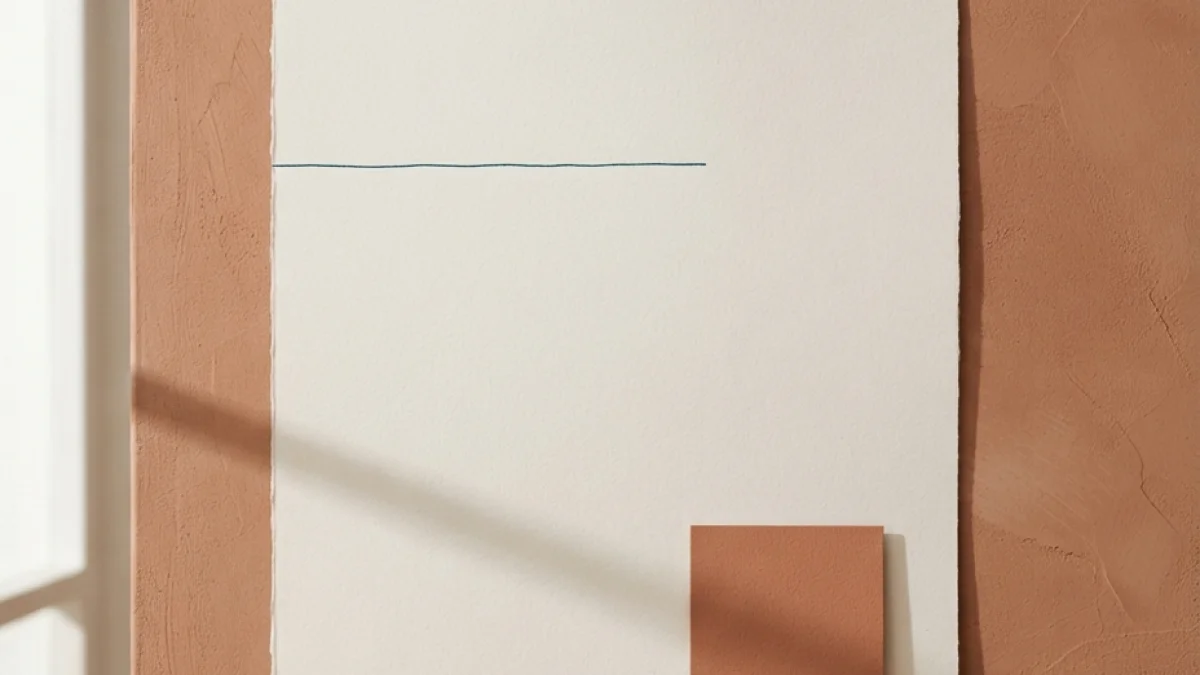
Image generated with AI.
Your AI background looks great right up until the headline sits on it. How to prompt for real copy space, the ratio and safe zone each placement needs, and the three fixes for a background that is already too busy.
Your AI background looks great until the headline lands on it. That is the moment you learn whether the prompt asked for a picture or for room to write on - and AI prompts for background images rarely mention the room.
The fix is not a better model. It is the order of your decisions: placement first, empty space second, image third.
A Background Image Has One Job
A background is not the hero of the page. It is the surface a message sits on, and it works only when the text on top stays readable at every size the page is consumed in. Judge it there, not in the generator preview.
Pretty and Unusable Are Not Opposites
Backgrounds fail in two ways, and neither is an ugly image. The first is a background with no copy space: the subject or the texture fills the frame, so any headline fights the picture instead of sitting on it. The second is detail directly under the headline, where the eye cannot separate the letters from the noise behind them.
The cheap test is scale. Look at the image at the size it will be seen first - feed thumbnail, blog card, video preview - not at full screen. Busy backgrounds collapse into a grey smear there, and the detail you worried about disappears anyway.
Text Over an Image Is a Contrast Number, Not a Vibe
The reference you can cite is the contrast minimum in WCAG 2.2, success criterion 1.4.3: 4.5:1 for normal text and 3:1 for large text (18pt, or 14pt bold). A background can look tasteful and still fail that threshold, because the luminance of the image behind your type is close to the luminance of the type itself. "It looks fine on my monitor" is not the measurement; the ratio is.
The Image Is Half the Job
The other half is layout: where the text goes, how large it is, and what layer separates it from the picture. A scrim, a card, a solid band - all layout decisions, none of them the image model's job.
Step 1: Pick the Placement Before You Write the Prompt
The Ratio Is a Composition Decision, Not an Export Setting
The common mistake is generating a nice square and cropping it to widescreen later, because the crop removes exactly the air you needed. Keep one master image as a reference for palette and light, but when the subject position and the copy space change, generate the placement again at 1:1, 4:5, 16:9 or 9:16.
The Numbers Each Placement Asks For
Three measurements cover most of what people publish today: the Open Graph card at 1200x630, a vertical story or reel at 1080x1920 in 9:16, and a profile header at 1500x500. In vertical formats the interface itself covers the top and bottom of the frame - a practical guide is to keep important content out of roughly the outer 250 pixels on each end - and on a profile header the avatar sits over the bottom left corner, so the useful copy space is the center and right half, not the edge.
Treat all three as what platforms publish today, not as permanent rules. They change, and any measurement copied from an article should be revalidated before you build a template around it.
Write the Placement Down Before You Prompt
One line is enough: destination, ratio, where the text lives, which part of the frame stays empty. That line becomes prompt words in the next step, and it stops you from generating five images and deciding afterwards which one has room.
Step 2: Write the Copy Space Into the Prompt
The Words That Produce Space
Name the empty region instead of hoping for it: "a large empty area in the right third", "clean negative space in the upper left", "uncluttered lower third", "plain flat wall behind the subject". Pair those with a low-detail instruction for the same zone, and add "no text" so the model does not write your headline for you - typography inside the image costs you control of typeface, size and line breaks that a design tool gives you for free.
The Words That Eat the Space
Density words push detail into every corner, including the reserved one: "ultra detailed", "masterpiece", "intricate", "busy", "highly textured". The catalog shows the difference plainly. One workspace illustration asks for clean lines and a centered composition and one cloud scene asks for an ultra soft render - both tolerate text almost anywhere. A neon city scene asks for ultra detailed instead, and it needs a reserved zone or a veil before type reads on it.
Expect the Model to Fill Some of It
Generators tend to populate the frame. Ask for the space, check it in the first generation, and if detail still creeps in, solve it in the layout instead of regenerating ten times.
Step 3: Three AI Prompts for Background Images, Three Jobs
These three prompts are not a ranking. They are three jobs a background has to do, each with its own copy space behavior.
The Blog Header and Social Card
Isometric cozy workspace illustration builds a warm desk scene - pastel palette, clean lines, 3D render style, centered composition, square format - and the catalog lists it for blog headers and social posts. The useful property is that the scene is a self-contained object: the air around the vignette is your copy space, no carving required.
The Ambient Wallpaper or Section Divider
Dreamy pastel clouds landscape is a low-frequency background: pastel dawn sky, soft clouds, gentle light rays, ultra soft rendering, no parameters to tune. Almost any region tolerates text over it, which makes it the better choice for section dividers, pull quotes and newsletter headers, where a photographic subject would compete with the words.
The Dark Cover
Cyberpunk city street in neon rain is the hard case: a rainy night street, magenta and cyan neon, volumetric fog, mirror-like reflections, ultra detailed, widescreen. The catalog lists it for covers, and it works - with large white type, a reserved calm zone or a scrim, and the social margins respected if the cover doubles as a share image.
Step 4: Fix a Background You Already Love
You do not always get to regenerate. When the image is approved, the fix moves into the layout, and the guidance from the Nielsen Norman Group on text over images is the right anchor: guarantee sufficient contrast, and prefer subtle adjustments that raise legibility without changing the look of the page.
Fix 1: The Gradient Scrim
A dark-to-transparent gradient over the text zone lifts contrast enough for white type to read without hiding the picture. Fastest repair, least damage to the image you already approved.
Fix 2: Blur or Darken the Band
Duplicate the layer, mask it to the band where the headline sits, and darken or blur only that strip - or use a backdrop filter on the web. You keep the whole image and create the low local detail that was missing. The failure mode is overdoing it: if the band reads as a pasted rectangle, the repair is more visible than the problem.
Fix 3: Re-Crop or Regenerate at the Target Ratio
Reframe so the subject releases a zone, or generate the vertical and square versions separately. Stretching is not an option, since scaling between ratios deforms or crops. And the headline stays work for the layout, not the model - even with generators that render type, the font, the size and the line length still have to be yours.
Step 5: Make It a Set, Not a One-Off
Lock Three Things
One palette, one light direction, one treatment - flat illustration, soft render, dark photo - reused across every header for the period. Three backgrounds per family is enough variation without the blog looking like three different people built it.
Name Files by Placement
header-16x9, social-1x1, story-9x16. Destination in the filename prevents the improvised re-crop and tells you six months later what each file was generated for.
Pre-Flight Checklist Before You Generate
- Destination and ratio decided before the prompt was written.
- The line describing where the text lives exists on paper.
- The prompt names the empty region by position and asks for no text.
- No density words aimed at the headline zone.
- Reviewed as a thumbnail, not at 100 percent.
- Contrast checked against 4.5:1 normal and 3:1 large.
- No platform measurement treated as permanent.
The three prompts cover the useful range for a content site - a clean vignette for a blog header, an ambient field for dividers, and a dense dark scene for a cover image. Start with one destination and one ratio, and judge the result by the work it lets you do on top of it rather than by how it looks on its own.
LikePrompts Editorial
Practical guides for getting the most out of AI prompts — written by the LikePrompts team.