AI Prompts for Contact Forms: Build the Failure Path First
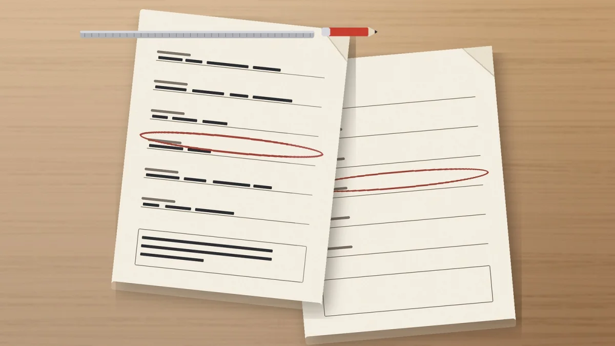
Image generated with AI.
A contact form is not a set of fields - it is a conversation with one failure path. Prompt for labels that survive typing, errors that instruct, focus that lands where the problem is, and a submit that tells the truth.
Your generated form looks finished and behaves unfinished. That is what you get when AI prompts for contact forms are written for a screenshot instead of a conversation, and the difference only shows up on the day something goes wrong.
AI Prompts for Contact Forms Starts With the Four Things a Field Says
The Screenshot Wins by Default
A generated form is optimized for the frame: inputs align, the button is wide, the gradient is soft. Everything a person needs on the day something fails - the expected format, the correction, where the cursor went - is invisible in that frame. That is why a form can look complete and behave incomplete, and why the prompt must ask for text no screenshot shows.
Four Pieces of Text, Not One Layout
Every field says up to four things. The label says what is being asked. The hint says in what format. The error says what to do now. The receipt says the answer arrived. A model will write one of the four and skip the rest without mentioning it. So the unit you prompt for is not "a form" but "a field and the three sentences around it".
AI Prompts for Contact Forms: The Label That Has to Survive Typing
A Placeholder Is Not a Label
A placeholder disappears at the first keystroke, which is exactly when the person needs to check what they are answering. What remains is an unnamed box. State the rule literally: the label sits above the field and stays visible, and the placeholder is at most an example of the format, never the name of the field. Then ask the model to name that failure in its own output, so you can see it in the file it hands you.
Write the Label as the Question, Then Reuse Its Words in the Error
GOV.UK's error message guidance asks error text to reuse the language of the question or the field label, because that is what lets a person match the message to the field. Turn it into a prompt instruction: every error string must contain the label's words verbatim. It is the cheapest quality rule in this post, and you can test it by eye.
Put the Format in the Label or the Hint, Not in the Error
The date field is the canonical case. The format belongs before the person types - "Date of birth (DD/MM/YYYY)" - not in a message afterwards. If the format only appears after a failed submit, the prompt is asking the person to fail first in order to learn the rule.
The Error That Instructs Instead of Blaming
Identify in Text, Not in Red
WCAG 3.3.1, Error Identification is Level A and requires an input error to be identified and described to the user in text. A red border identifies nothing to a screen reader, nothing to a colour-blind reader, and nothing to anyone glancing at the page. Ask for the error as a sentence next to the field, and require that the sentence names the field.
Suggest the Correction When You Know It
WCAG 3.3.3, Error Suggestion goes further at Level AA: when a correction is known, suggest it. "Invalid date" identifies. "Enter the date as DD/MM/YYYY" suggests. Put one good and one bad example per field inside the prompt, because the model copies the register of your example faster than it follows your adjectives.
One Summary at the Top, Linked to the Field
GOV.UK's error summary pattern asks the summary to take keyboard focus, to link to each answer that failed, and to word each line the same way as the message next to the input. Ask for both layers in one prompt: a summary at the top with a count, and an inline message at every field, each line pointing at its own field. Then you can check the pair in ten seconds. Ban two things outright: error codes, and the word "invalid" on its own.
Focus Is the Rule You Cannot See in a Mockup
Where the Cursor Goes After a Failed Submit
On a long form the failure happens off-screen. The person presses send, nothing visible changes, and the message sits above the fold. The prompt must state where focus moves after a failed submit - to the error summary or to the first invalid field - and that the summary is announced, not merely rendered.
The Focus Ring the Model Deletes
Generated CSS routinely ships outline: none on interactive elements, because a focus ring looks ugly in a screenshot. Ask for a visible focus-visible style in the prompt, then check it with the keyboard: the ring either appears when you tab, or it does not.
The Keyboard Test Is the Whole Test
Fill the form with Tab, the arrows and Enter only, and submit it wrong on purpose. If you cannot see where you are, or cannot reach the summary, the prompt is not finished. That test takes two minutes and catches the three defects above at once. WCAG 2.4.7, Focus Visible is Level AA, and it is the criterion behind the exercise.
Three Catalog Prompts for the Three Parts of a Form
A form has three parts that fail separately: the field, the button, and what happens on the server.
The Field and Its States
The React Component Generator prompt asks for the component file with typed props, Tailwind styles that include a focus-visible style, an accessibility block with keyboard support and focus management, the loading, empty, error and disabled states, the edge cases around zero items, and a test file. That list is the failure path written as a specification. Use it for the field, not for the pretty layout.
The Button and the Line Under It
Website Hero Copy in 30 Minutes returns a call to action of four words at most, a trust line under the button, and a clarity test: would a stranger understand what this does in five seconds? Applied to a submit button, that is the difference between "Submit" and "Send message".
The Server Side and Its Manual Checklist
PHP and WordPress Developer delivers namespaced PHP with sanitization and escaping, a hooks map, a security block, and - the part this post needs - a quick manual test checklist with a snippet to verify. A contact form needs exactly that: a short list a human runs after submitting, to prove the message arrived.
The Five-Line Form Card and Three Tests
The Five Lines
Write these five lines before you prompt. (1) What is asked first, and why. (2) The exact label words for every field. (3) The error template per field, in the imperative: "Enter your email as name@domain.com". (4) Where focus lands after a failed submit. (5) What the person sees after success, including what was sent and when. That card replaces "make me a contact form".
Test One - The Blank Submit
Submit the empty form and count the errors. If any field is silent, the prompt skipped it.
Test Two - The Wrong Format
Type one invalid value per field and read each error aloud. If it does not tell you what to type, it only identified the problem.
Test Three - The Keyboard Only
Complete the form without the mouse, then submit it wrong. Visible focus, reachable summary, cursor where the problem is.
What the Model Cannot Check
It cannot see the rendered page, so it cannot confirm the ring is visible at your zoom level, that the summary sits in the viewport, or that the message is announced. It does not know your validation library's API and will invent attribute names that look plausible. It cannot verify that the message was stored or sent, because the thank-you page is generated, not observed. The human checks are cheap: one keyboard pass, one wrong value per field, and opening the record that arrived. Keep the claims small too, since this is a post about the failure path, not an accessibility certification.
FAQ
Is a placeholder ever acceptable?
As an example of the format, yes. As the only name of the field, never.
Should errors appear while I type?
Decide it explicitly in the prompt. The failure to avoid is scolding on every keystroke while the person is still answering.
How many fields should a contact form have?
Only the ones you will use, because every extra field is another place where the failure path can be missing. GOV.UK's question pages guidance, which asks for one question per page in service forms, points at the same principle, though it does not require a website form to be split up.
Can the model write the validation rules?
It can draft them, and only the server decides. Treat generated rules as a proposal and test them.
LikePrompts Editorial
Practical guides for getting the most out of AI prompts — written by the LikePrompts team.