AI Prompts for Design Assets: Write for the Container, Not the Canvas
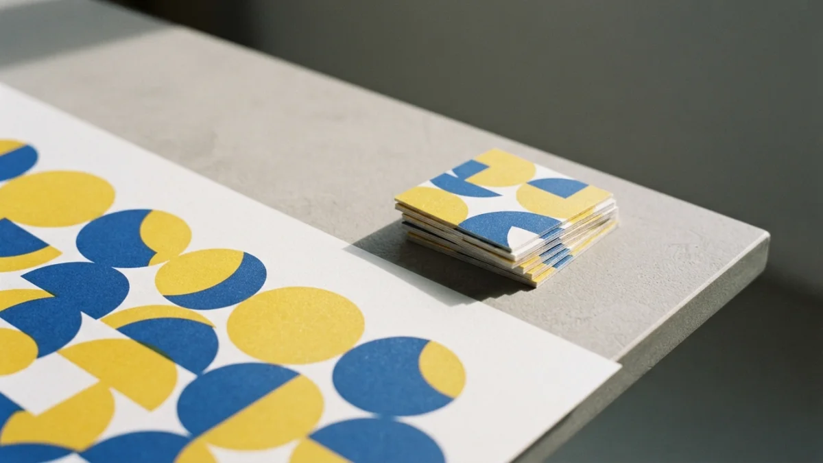
Image generated with AI.
An image is approved on a canvas and then shipped into a grid, a 48-pixel square or a 3:4 crop. Write the constraint, then test the file where it will live.
A design asset is approved on one surface and then shipped into a repeating grid, a 48-pixel square or a 3:4 crop. These AI prompts for design assets are written for those three containers - the places the canvas you approved the image on never shows you.
The Container Is Not in the Image
A container is the place where the file gets used: a grid that repeats it, a minimum square, a rectangle that crops it. The canvas where you approve the picture - your screen at 100% - is the only place where none of those three things exists. The moment the file leaves that canvas, three properties that were invisible decide whether it is usable: the pair of edges that has to match its neighbour, the smallest size, and the rectangle of the crop.
One honest calibration before the rest: this is not a claim about how the model works. It is a claim about where you look when you approve. A picture can be the best of the session and still fail all three.
Why AI Prompts for Design Assets Need a Constraint, Not a Style Word
"Modern, clean, premium, minimal" describes taste, and taste cannot be violated: nothing in the image can break it, so nothing can be checked. A constraint is a rule with a number or an either/or, and that is exactly why it can be tested: tileable on all four edges, no more than two colours, no gradients and no photorealism, still readable at a 32-pixel favicon, no hands and no text.
The prompts in the catalogue write their constraints into the prompt text itself, and that is the point: the constraint is the promise the file has to keep outside the canvas. A reusable prompt is a template you fill in; the constraint here is a promise about the file, and a promise needs a test.
Container 1 - The Repeat: Tile It, Don't Look at It
What a Tile Owes Its Neighbour
A tile has two pairs of opposite edges that are obliged to match: what leaves on the right enters on the left, and what leaves at the bottom enters at the top. The model hands back one image, not a tile, and you look at the centre, which is the only part that never has to join anything. The typical symptom is a hero motif sitting dead centre, repeating across the grid like a rubber stamp.
The Test Is an Offset, and Then a Half-Drop
The well-known technique is the Offset filter: it splits the image into four quadrants and swaps them, so the seams land in the middle where you can actually see them (Photoshop Roadmap). What almost nobody tests is the half-drop. Half-drop is the repeat layout used on most traditional wallpaper and on a lot of textile prints: alternate rows are offset by 50%, and a tile can be seamless in a straight grid and still break in half-drop, because the top and bottom edges also have to offset-match (Texloom). A pattern that only passed the grid test has not been tested on the wall it will live on.
The Prompt That Writes the Constraint
The catalogue prompt writes the rule into its own sentence: a seamless repeating pattern, with the elements flowing naturally across the seam, a flat composition and balanced density, suited to fabric and wallpaper. The last two are container constraints. Flat means no vanishing point and no directional light that cannot repeat. Balanced density means no sector that empties out when the grid multiplies it. See Surface Pattern Designs.
Container 2 - The Smallest Size: Shrink It
The Number Comes From the Place, Not From the Prompt
A logo is approved at 1024 pixels and lives at 16 to 48. The useful number is not an opinion: Google Search documentation asks for a favicon that is square (1:1), at least 8x8 pixels, and it recommends going above 48x48 so the icon looks good on every surface (Google Search Central). The catalogue prompt asks for a scale down to 32 pixels. The number in the prompt is a design intention; the number from the container comes out of the platform's document, and when the two disagree, the container wins. One warning: do not repeat the "multiple of 48" rule that circulates in third-party blogs, because it is not in the official documentation.
The Test Is a Shrink, Not a Zoom
Scale the file down to the size of the container and look at it at 100%, from a distance, for one second. If the silhouette does not read, the design belongs to the large size and not the small one. That is exactly what the prompt prevents on paper when it demands simple geometric forms, at most two colours, no gradients, no photorealism, a single centred mark and a white background. Without those, the file does not have a small version, it has a blurry one. See Logo Design System for ChatGPT.
Container 3 - The Crop: Compose for the Ratio You Didn't Choose
Feed Ratios and the Safe Zone
The feed accepts 1:1, 4:5 and 1.91:1 (1080x1080, 1080x1350 and 1080x566), but the profile grid shows your post cropped to 3:4, so the practical rule is to keep what matters inside that 3:4 safe zone (Buffer). The old advice to make everything square no longer describes the current grid. For a generated photo the consequence is direct: choose the angle and the empty space before you generate, because you do not choose the crop.
The Test Is a Crop You Didn't Ask For
Crop the image to 1:1 and to 3:4 and check whether what sells the dish is still inside - the steam, the texture, the sauce. The catalogue prompt already carries constraints that survive that crop: a 45-degree overhead angle, so the plate reads the same in a square, visible steam, and fine detail such as herbs, drops and crumbs that survives at 200 pixels. See Appetizing Food Photography.
What Still Isn't Yours
Three things no constraint resolves, and all three are checked off the canvas. The seam: it is proved with the offset and the half-drop, not requested politely. The container number: it changes with the platform, 3:4 today and whatever its document says tomorrow. And the rights: whether a mark is registrable, whether a typeface is licensed, whether a face is recognisable - none of that the model signs. If the file ends up printed, the print shop's margin is one more container, and that is a different topic and a different post.
Order: Find the Container, Then Write the Prompt
The order that saves rework: one, name the container and read its specification at the source - the platform's documentation or the printer's sheet, not your taste. Two, write the constraint that matches that specification. Three, generate. Four, run the container test: offset and half-drop, shrink, crop. Five, approve. Approving before step four is approving an image, not a file.
Write for the Container, Not the Canvas
The canvas is where you like it; the container is where it works. Write the constraint first, then test the file where it will live - and start from prompts that already write it: Surface Pattern Designs for the repeat, Appetizing Food Photography for the crop, and the logo design system for the smallest size.
LikePrompts Editorial
Practical guides for getting the most out of AI prompts — written by the LikePrompts team.