AI Prompts for Product Labels: Design the Panel, Not the Picture
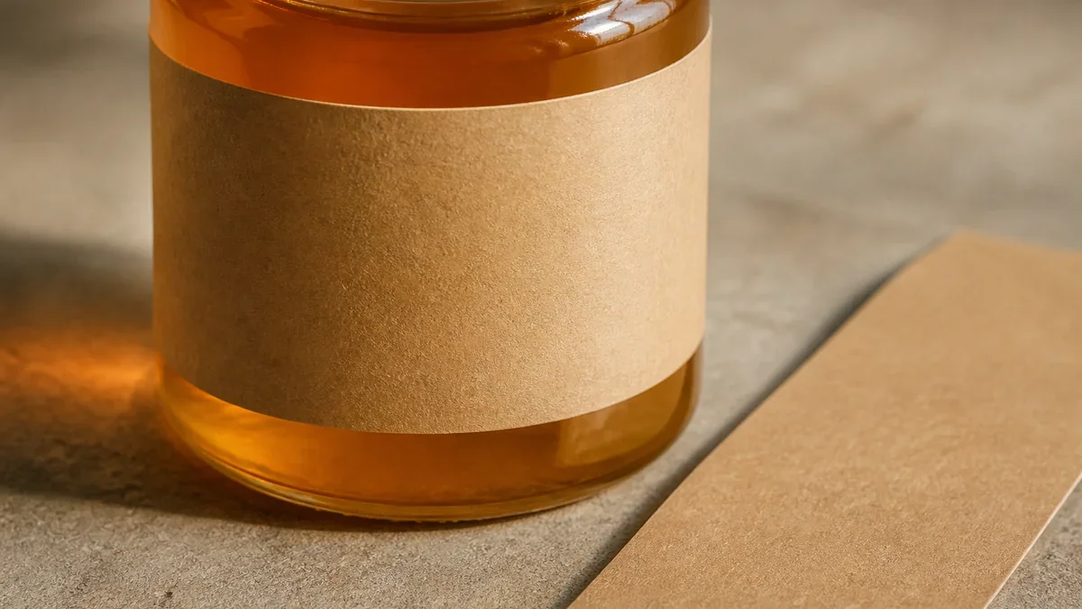
Image generated with AI.
A label is a legal panel wrapped around a curve, not a picture with a name on it. Use AI prompts for the art, then set the type yourself - here is the order that works.
A label is not a picture with a name on it. It is a measured panel wrapped around a curve, and it has to carry text you do not choose. AI prompts for product labels only work when the panel comes first and the art second.
Most people start the other way: they ask for a beautiful label and get one, a square canvas with painted edges and invented lettering, unrelated to the jar it will sit on. Then they spend an afternoon dismantling it. This walks the direction that avoids that, from the container outward.
A Label Is a Panel, Not a Picture
Write this above your desk: a label is a measured panel with a mandatory text block, and the model paints only the part that is neither. The panel has a fixed width, the container a fixed circumference, the text block a fixed minimum size. Design decisions live inside those three constraints.
The Three Measurements You Take First
- Diameter of the body where the label sits. For a 65 mm jar the circumference is pi times 65, about 204 mm.
- Height of the flat, printable band. Shoulders and base fillets do not take ink cleanly.
- Front panel width you want read head on. A 55 mm panel on that jar covers roughly 27 percent of the wrap.
The useful width is never the full circumference. Subtract the overlap where the label glues to itself, typically 6 to 10 mm, and stay a few millimetres off the seam, because paper curving away from the eye stops being readable. With 8 mm of overlap that jar leaves about 196 mm usable, and a 55 mm panel is still a quarter of the wrap.
The Block That Is Not Design
Write the mandatory block before generating anything, because it decides where the illustration cannot go: product name, net quantity, ingredients, allergens, the responsible business, lot code, barcode. That block is a fixed rectangle of type. If the art has already claimed the top third, the block lands on a painted flower.
Barcodes are the strictest part. GS1 US guidance on placing barcodes asks for a clear unprinted strip on both sides of the symbol, art created at final print size, and a spot in the lower right of the back panel with enough white space to scan. None of that comes from a prompt. It comes from you, holding a ruler.
What the Model Does Well, and the Three Things It Cannot Do
Image models are extraordinary illustrators and terrible typesetters. Knowing which half you are handing over is most of the skill.
It Paints the Motif, Not the Text
Ask for a botanical illustration and you get a genuinely beautiful one. Ask for the same image with the product name on it and you get shapes that resemble letters: readable at thumbnail size, smudges at 60 mm, and never the same invented word twice, so there is nothing to correct. Generate art with no text, then set the type in a real design tool.
It Does Not Know Your Market's Type Size
Minimum type size is set by regulation, not taste. Under EU Regulation 1169/2011 mandatory information must reach an x-height of at least 1.2 mm, and 0.9 mm on packages whose largest surface is under 80 square centimetres; the Irish food safety authority summarises the same rule on its labelling guidance page. In the United States, sizes are expressed in points under 21 CFR 101. Treat any number here as a starting point to re-validate against your own market's authority, and confirm the fine print with the printer.
It Has Never Seen Your Substrate
Matte uncoated paper swallows ink and lifts the black. Glossy vinyl mirrors the shelf lighting. Amber glass tints everything printed behind it. A palette approved on a bright monitor turns muddy on kraft stock, and the model has no idea what you are printing on.
Prompt 1 - The Illustration That Leaves Room
Start with the painted half. The watercolor botanical illustration prompt produces soft eucalyptus branches and wildflowers in muted green and blush on a plain white background, hand-painted texture, no text. Its listing says it suits packaging, and for a front panel that is right: a white ground is where type can land.
Three things you add. One subject, not a bouquet: a dense arrangement loses its shape the moment it wraps a cylinder, while a single branch keeps its silhouette. A named empty zone - the upper third, or the left side of the panel - stated in the prompt as space the illustration stays out of. And a one-colour version of the same motif for the back panel, where the mandatory block lives.
Then print it at actual size, cut it out, and hold it at arm's length. If you cannot name the plant from that distance, the drawing is too fine for a 55 mm panel.
Prompt 2 - The Mark That Survives Twenty Millimetres
Most labels need one small mark: a seal, a monogram, a claim badge. The minimal logo icon prompt is built for that - a flat vector icon in two colours, simple bold shapes, centred on a solid background, no gradients, clean edges. The solid background becomes the container colour, and two colours is all a 20 mm badge can carry before it turns to mud.
The test is not on screen. Scale the mark to its real printed width, 20 to 25 mm, put it on a strip of paper in the actual container colour, and look at it under the light where the product sells. If it disappears, it was drawn for a portfolio.
Prompt 3 - The Mockup Shows the Shelf, Not the Proof
The product mockup studio prompt gives clean commercial photography: soft light from the upper left, realistic shadow, light grey gradient background, product centred and filling about 70 percent of the frame, slightly angled. At $2.99 it is the cheapest way to see a design in context, and the easiest to mistake for a production check.
What it answers: does the panel read from shelf distance, and does the illustration fight the text block? That is a merchandising question, and a mockup is a fair way to ask it. What it does not answer: whether the file prints, whether the colour matches, whether the die cut lands where you think, or whether a scanner reads the barcode through the quiet zone. A mockup is a sales hypothesis; the printer's proof is the test.
The Order of One Evening: Running AI Prompts for Product Labels in Sequence
- Write the mandatory text block in full, every line a regulator or retailer requires.
- Measure the container and calculate the panel: circumference equals pi times diameter, minus overlap and seam margin.
- Generate the illustration with the empty zone reserved and no text.
- Generate the mark, then scale it to 20 mm on the real container colour.
- Compose the panel in a real design tool, real font, verified x-height, text block placed first.
- Generate the mockup for the product page and confirm the panel reads at shelf distance.
- Print at 100 percent on paper, cut it, stick it to an empty container. This step catches more errors than the six before it.
- Request the printer's proof: colour, stock, registration, barcode scan. Approve nothing else.
None of it is glamorous. All of it is cheaper than a print run rejected over a quiet zone.
FAQ
Can the model write the legal text for me?
No. It can help draft phrasing, and even that needs human review against your market's rules. The mandatory block has to be correct, and a plausible-looking sentence is worse than no sentence. Confirm requirements with the authority for the market you sell in.
How wide should the panel be?
Circumference minus overlap and seam margin. A front panel of roughly 50 to 60 mm covers the readable face of a small jar. Anything wrapping past the curve stops being read head on, so keep the text inside the flat face and let the art travel.
Is the mockup enough for the product listing?
For the storefront, usually yes. For production, never. Ask for a proof, and look at the printed piece rather than the render before approving a run.
If you want a starting point instead of a blank canvas, the botanical illustration prompt is the one this workflow was built around: painted branches on a white ground that leaves the text block somewhere to live.
LikePrompts Editorial
Practical guides for getting the most out of AI prompts — written by the LikePrompts team.