Consistent Brand Visuals With AI: Style Locks, Variations and Upscaling
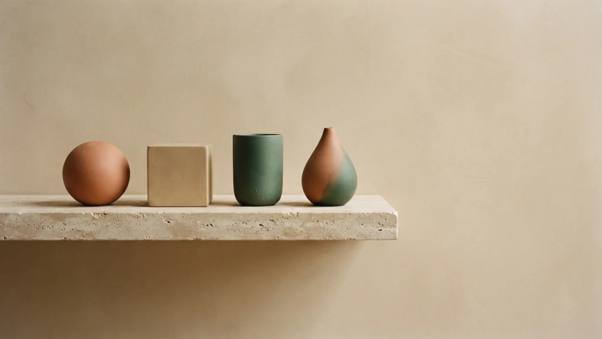
Image generated with AI.
One off-brand image breaks the set. Paste the same style block into every prompt, lock the look with a reference, vary one axis at a time, and upscale the winner - so your icons, product shots and lifestyle scenes read as one brand.
One off-brand image breaks the set. Consistent brand visuals do not come from better prompts one at a time - they come from deciding once how the brand looks, locking that decision into a block of text and pasting it into every prompt that follows.
Most teams do the opposite: a fresh prompt per asset, then a set where the icon reads flat, the product shot comes back warm and the lifestyle scene belongs to another company. The model did not fail. The brief was never fixed. This guide covers the brand block, the rules that hold a series together, style locks and the step almost everyone takes too early: upscaling.
Why an AI Image Set Drifts (It Is Never the Model)
A single image can be excellent and still be useless to a brand. What breaks a set is not quality but agreement: every file was generated under slightly different assumptions about color, light and material.
Color, Light and Medium Drift Separately
Drift is three errors at once: the palette lives in loose words, the lighting mood changes between prompts, and the medium shifts from flat vector to 3D render to photograph, so each image is individually correct and collectively broken. Palette, light, medium and background are anchors, not variables.
What Consistency Costs in Time (per Image)
A finished brand image is not one prompt: a realistic flow runs minutes of prompt writing, variations, upscaling and post-processing, fifteen to twenty-five per asset. If the look is not fixed, the variation time goes into discovering a style instead of testing options.
The Brand Block: Four Lines Behind Consistent Brand Visuals
The block is four decisions written as one short paragraph at the front of every prompt. A solid image consistency guide lands on the same list: specific color names, one lighting setup, one medium and one mood descriptor.
1. Palette in Words (and One Palette Image)
Models do not read hex codes the way a design tool does, and Midjourney does not accept them directly. Upload a small palette image as a reference and keep concrete color names in the text - "muted terracotta, sand, deep green" - instead of the vague phrase "brand colors".
2. One Lighting Mood, Written Once
Lighting is the anchor people notice first when it changes. Pick one recipe - direction, hardness, time of day - and freeze it for the campaign. A soft upper-left key light and a hard noon sun are two different brands with an identical palette.
3. One Medium and Level of Detail
Choose a single medium: flat vector, clay render, glossy icon or real-world photography. Mixing media in one set is the most visible mistake in storefronts and feeds, and the same applies to detail level.
4. One Background Treatment and One Aspect Ratio
A solid background, a gradient and a full scene are three different brands. Fix the treatment with the aspect ratio, because the ratio changes how every subject is composed - before the first prompt, not after the first batch.
Style Locks: Copy a Look You Already Like
Anchors stop a set from drifting, but you still describe the look in words. A style lock is faster: it copies a look that already exists.
Reference-Based Locks and Style Weight
A style reference tells the model to copy the aesthetic of an image or saved style code while leaving the subject free - the same treatment on an icon, a product and a scene. --sref points at that reference; --sw, the style weight, controls how hard it pushes, from 0 to 1000 with a default of 100. Low values leave the base prompt in charge; high values impose the reference.
Image Weight vs Style Weight (Do Not Confuse Them)
Two dials get mixed up. Image weight controls how much an image prompt influences composition; style weight controls how much a style reference influences aesthetic treatment. For a brand set, raise style weight for the look and keep image weight low.
When to Train Instead of Prompt
There is a ceiling: if you need the same product hundreds of times, prompting stops being enough and the next step is a private style LoRA trained on approved images. The brand block still defines that training set.
Variations Without Drift: One Axis at a Time
Variations are where sets fall apart. Models offer subtle and strong variations of an image you already like, and recombining everything at once is tempting. A brand set varies controlled axes - angle, background, crop - while the block stays untouched.
Subtle or Strong, Decided per Set
Decide once whether this is a subtle set or a strong set and hold it for the run. Mixing both produces files that look like different projects even when the palette matches.
The Seed Is Your Version Control
Prompt plus seed plus fixed parameters is what lets you return to the same look days later. Changing the seed to see what comes out is the most common source of orphan members in a coherent set: treat the prompt and seed pair as a version.
Five Variations Is a Set, Fifty Is a Rebrand
Size the set before generating: how many images the campaign actually needs. Then stop. Generating fifty and choosing afterwards burns GPU minutes and ends with pieces that never quite fit.
Upscale Last, and Only the Winner
Upscaling is a finishing step, not part of exploration. Resolve the set at native resolution, choose the winner, then upscale. The official Midjourney upscaler documentation puts it plainly: both options double the size of the original, and the creative one changes the image a little because it adds new detail.
Subtle or Creative, Picked Once per Set
Because the creative upscaler adds detail that was not there, mixing both leaves an image jumping against the rest of the series. Pick one upscaler for the whole set, even if the other looks marginally better on one file.
Upscaling Is Not a Fix, and It Costs
Upscaling can consume more GPU minutes than generating the initial images, and it will not rescue a soft source. Its job is to take a correct image to print resolution, not to repair a bad one.
Print Targets and External Upscalers
For large print formats, decide the destination first - screen, A3, poster - and work backwards to the pixels it needs. Then approve at native resolution, upscale with the model's upscaler and, if more is required, use an external upscaler chosen by the type of source. Without a destination, upscaling is spending without a criterion.
Do Not Invent the Product
A generated scene cannot establish a feature the source photo does not show: if the detail is not on the real product photo, it cannot appear in the asset. For documentation, keep accurate photography and use AI for backgrounds, scenes and creatives - and reserve generated imagery for the campaign layer.
A Three-Prompt Brand Kit (Same Block, Three Jobs)
The pattern only matters if it survives real work. Here it is with three catalog prompts: same anchors, different subject.
The Mark
Start with a minimal logo icon - the easiest piece to fix as the anchor of the kit, because the palette is literally a field in the prompt: two flat colors, simple shapes, centered on a solid background, no gradients, no text. Klein Minimal Logo Icon is built exactly that way.
The Product
The same color behind the icon becomes the studio backdrop for the product shot, and that turns two files into a family. Klein Product on Color asks for a solid background, even lighting and a subtle shadow, which also makes it fast for product photo tests.
The Scene
The third member is the stress test: the same product in a real context, where the background is no longer solid. FLUX Product Lifestyle Scene keeps natural morning light, real textures and a warm color grade - the moment a brand block either holds or shows its cracks.
The Brand Image Checklist Before You Ship
- Palette written with concrete color names, plus one reference image.
- One lighting mood across every asset.
- One medium and one level of detail.
- One aspect ratio and one background treatment.
- One upscaler for the whole series, not per file.
- Product claims checked against real product photography.
- Final test: line every image up. If one jumps out, it is not ready.
Build the kit once and the next campaign starts from a fixed look instead of a blank prompt. Pick the mark, the product shot and the lifestyle scene - a minimal two-color logo icon, a product on your brand color and a photorealistic lifestyle scene - and they will read as one brand from the very first batch.
LikePrompts Editorial
Practical guides for getting the most out of AI prompts — written by the LikePrompts team.