AI Prompts for Icon Sets: One Coherent Family Instead of Six One-Off Icons
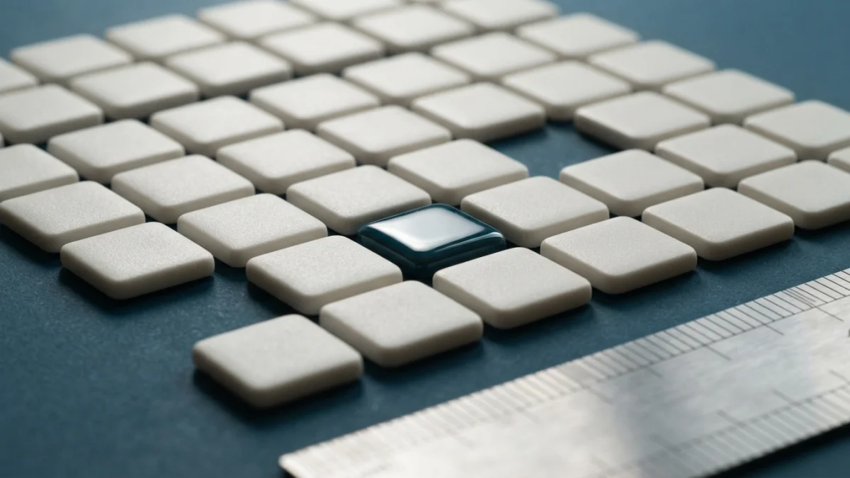
Image generated with AI.
Six icons generated, three different styles. The model is not the problem: a set needs one module, one stroke weight and one light source before you write a prompt. How to lock those decisions, what has to repeat in every icon, and how to ship the file at 24px, 66dp and 1024px.
An icon is not a picture. It is one piece of a system, and AI prompts for icon sets only work when the system is decided before you write a single prompt.
Twenty-four icons, each one beautiful alone. Put them in a row in the interface and they look like three different designers: one heavy stroke, one square corners, one lit from below. The model is not the problem.
This post covers the order of the work - module, one style block, piece by piece, small-size test, ship - the three catalog prompts, and the step almost nobody does: looking at the whole set at 24 px.
Why One Beautiful Icon Is Not a Set
An icon is approved alone and used in a row, and those are two different judgments: drawing quality, and whether the piece belongs to the same family as its neighbours.
The model has no memory of the previous piece, so "make it look like the others" is not a usable instruction: whatever is not written down gets re-invented on every generation.
The Four Things That Actually Drift
Four properties move on their own when nobody pins them down: stroke weight, corner radius, light direction and optical size. All four are system decisions, and left to the model they drift even when the prompt looks identical. Optical size is the one people miss.
The Small-Size Test
An icon gets looked at 24 px, or 16 px in a favicon, and almost never at the size it was generated. Only silhouette and contrast survive: details dissolve, thin strokes turn grey, a 3D render becomes a smudge.
Approve the set by looking at the full row at real size, not zoomed piece by piece; zoom hides the failures you are about to ship.
Step 1 - What AI Prompts for Icon Sets Have to Decide First
Before writing anything, settle the module: the geometric contract every piece accepts - grid, stroke, corner, light. It is the difference between a set and a pile.
One Grid, One Stroke
The Material icon system works on a 24x24 dp grid with 2 dp of padding around the live area, a recommended 2 dp stroke weight for curves, angles and both inner and outer strokes, and a 2 dp corner radius. In the outlined style inner corners stay square, and strokes of 2 dp or less are not rounded.
That grid is what makes a square and a circle read at the same weight, and it lets you point at the piece that is off instead of arguing about taste.
One Light, One Angle
If the set has volume, one key light from one side and one camera angle for every piece; icons read in a row with different lighting look like a mounting mistake, not a stylistic range. If the set is flat: solid colour, no light, no shadow.
Monochrome First, Color Later
A set that works in a single colour survives dark mode, the monochrome launcher layer and badge overlays, and approving it is cheaper than repairing a coloured set later.
Step 2 - The Mark, the Set and the 3D Sibling
Three catalog prompts cover the three jobs one icon family usually has: identity, interface and marketing. Different objects, same module.
The Mark
MJ Logo Icon Style Guide is the brand-mark recipe: a style (flat, 3D clay, gradient or line art), a concept and a colour palette, centred, soft studio light, simple clean shapes, solid white background, no text, 1:1 frame. The white background is what lets you cut the icon out and test it over light and dark surfaces without regenerating it, and the centred composition is what the launcher masks in Step 4 assume.
The Set That Reads All at Once
Klein Game Asset Icons is the only prompt in the catalog that asks for a set rather than a single piece: game UI icons - items, skills, resources - with contour and lighting consistent across every icon, centred on a solid colour background with a rounded corner, bold shapes readable at small sizes, no text.
The method is simpler than the prompt suggests. List the subjects. Generate one piece at a time. Paste the same style clause - contour, light, background, bold shapes readable at small sizes - into every generation, changing only the subject. That rule removes most of the drift above.
The 3D Sibling
Turbo 3D Render Icon covers the family with volume: glossy soft plastic material, rounded forms, pastel palette, soft studio light and shadow, simple light background, centred. It earns its place in onboarding screens and marketing pieces, where the 2 dp grid no longer rules but one light and one silhouette still apply.
Step 3 - Keep the Style Without Re-Describing It
Reference the Style, Not the Subject
In Midjourney a style reference takes the visual vibe of a reference image - colours, medium, textures, lighting - and applies it without copying the objects or people in it. For a set that is the tool you need: lock the reference once, change only the subject. Designers in the niche describe it as the parameter that holds stroke weight, palette and corner treatment steady.
The Style Block You Paste Verbatim
Write the style block once - grid, stroke, corner, light, background, no text - and paste it character for character into every generation. The classic error is paraphrasing it: "thin" on one piece, "clean lines" on the next. That set speaks two vocabularies, and that is already system drift.
Step 4 - Ship It: Sizes, Safe Zones and the SVG Trap
The Sizes That Are Actually Required
The same artwork has to survive three scales. In Android, adaptive icon layers are sized at 108x108 dp and the glyph has to live inside a 66x66 dp safe zone, because the launcher crops each layer with a different mask depending on the device; the layers should carry no mask of their own and no shadow around the edge, and a monochrome layer feeds the themed icons. On the App Store the master is a 1024x1024 px PNG with no transparency and no pre-rounded corners, and Google Play uses 512x512 px. These are the figures the guidelines publish today - revalidate them against the official documentation before you deliver.
The SVG Trap
An image model returns pixels, not curves. Many tools sold as AI SVG generators convert a raster map into an SVG that carries the bitmap embedded, or produce hundreds of traced nodes full of noise: heavy files that do not scale cleanly and cannot be retraced to a 2 dp stroke.
For a line icon at 24 px, use the generated piece as a reference and redraw it on the grid, or simplify the trace and snap it to the grid, instead of trusting automatic tracing.
The Row Test
Mount the set in a row at real size - 16, 24 and 32 px - on a light and a dark background, then delete every icon with a detail that went grey or a stroke that disappeared. An icon that fails in the row gets replaced, not patched.
A 25-Minute Workflow for a New Set
- Decide the module: grid, stroke, corner radius and light direction.
- Write the style block in 12-15 words and keep it where you can copy it.
- List the subjects the set has to cover.
- Generate one piece per subject, style block identical every time.
- Run the monochrome pass and fix the shapes before approving any colour.
- Mount the row at 16, 24 and 32 px, then export per platform inside the safe zone.
Start with the module, not the prompt. The closest thing to a system in the catalog is the Klein game asset icon set. Use the logo icon style guide for the mark and the 3D render icon for the marketing pieces, and read our guide to style locks and variations for the discipline behind it. A set is never approved in a zoomed-in chat window - it is approved in the row at 24 px.
LikePrompts Editorial
Practical guides for getting the most out of AI prompts — written by the LikePrompts team.